The art of attraction: Graphic design principles in signage
Businesses strive to stand out in a crowded market. The distinct presence of a brand often begins with its signage. Distinct Sign Solution merges graphic design expertise with marketing insights to ensure your brand conveys its message effectively. We transform basic graphic design for signs into bold brand identities, inviting customers to look closer and engage with your business.
Creating the perfect sign
A compelling sign is a balance of content, color, and space. It’s a visual elevator pitch, persuading and informing in seconds. In this blog post, we’ll explore graphic design of signs, applying time-tested principles to create signage that captures the essence of your brand.
Good use of white space
The term “white space” might sound like a mere design consideration, but in the realm of sign graphic design, it’s a strategic tool. White space is the breathing room that gives your content clarity and impact. To better understand the function and importance of white space in design, read “The Importance of White Space in Graph Design” by the Director of Creative Services at the University of Florida.
Locally, the sign for Haley’s Honey Meadery is a testament to the power of restraint. The ample white space around the central logo and text isn’t wasted. The decision is purposeful, drawing the eye in and creating a memorable image.

Visibility and readability: Beyond the first glance
Visibility is more than size and height; it’s about creating a visual hook that catches and holds the viewer’s attention. It’s also about readability — ensuring that once you’ve caught the eye, you can deliver your message effectively. For an in-depth exploration of how design and placement affect sign effectiveness, the International Sign Association offers a comprehensive set of guidelines that are invaluable.
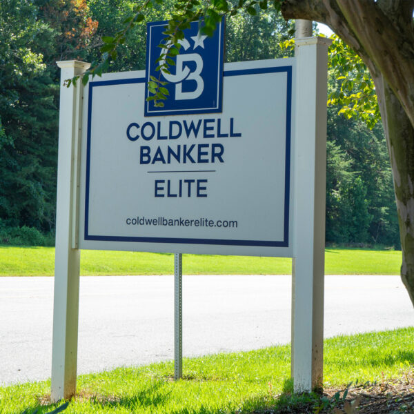
Coldwell Banker Elite’s signage serves as an example here. The high contrast between the text and the background, the unambiguous fonts, and the starkness of the design ensure that the sign is readable at a glance and from a distance.
The importance of simplicity in sign design
In a world of information overload, the simplicity in sign design is king. A clean, minimalistic approach ensures that your sign is seen, understood, and remembered. For an insightful look at how minimalist design can be both elegant and impactful, check out this blog post from Tupps Signs in Delaware on Minimalist Signage Design.
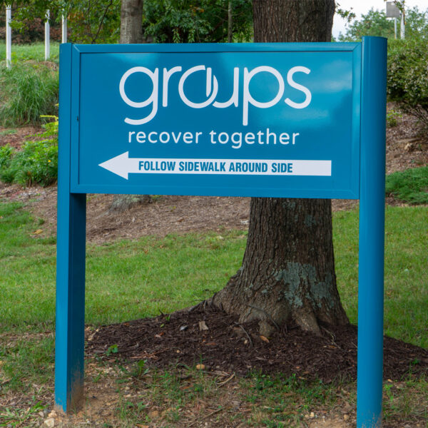
Our wayfinding sign for Groups Recover Together demonstrates simplicity in its design. With its stark use of space and a clear, sans-serif typeface, the sign conveys its crucial message without any unnecessary details. This deliberate choice embodies modern design principles, ensuring that the directions are easily seen and understood.
Visual hierarchy: Guiding the viewer’s journey
Signs often contain multiple pieces of information, but not all information is created equal. A well-structured visual hierarchy uses design elements to guide the viewer’s eye to the most important information first. You can get a good overview of this design principle in the post, “The ultimate guide to visual hierarchy” by Canva.
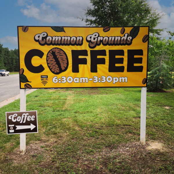
The sign for Common Grounds Coffee illustrates visual hierarchy well. By using a bold, oversized text for the word “COFFEE,” the sign immediately draws the eye to the central message. The surrounding graphics and smaller text for the hours of operation support the main message without competing for attention. This ensures that the viewer understands the primary purpose of the sign at first glance.
Mastering the impact of color contrast
Color is the voice of your brand, and contrast is how you adjust the volume. High-contrast color schemes ensure that your sign stands out and that your message is accessible to all viewers, including those with visual impairments. If you’re creating a sign and want to ensure your color choices are impactful, Adobe’s Color Contrast Analyzer is an excellent tool. Use it to verify that your design will be both striking and readable under various conditions.
The storefront sign for CBD Bees illustrates how contrast can be used effectively to create an eye-catching visual statement. The bright neon green and yellow colors stand out against the darker background. This draws attention from a distance and makes the sign a beacon for the business.

Using appropriate fonts in graphic design for signs
The font you choose is as integral to your brand identity as the words themselves. The right typography can give your sign with personality and professionalism, ensuring the tone matches the context of your message. For guidance on selecting the perfect font for your signage, consider the insights from Reliable Signs’ blog post on the best and worst fonts for sign design, which offers valuable tips for making your message resonate.
The Morningside House sign demonstrates the importance of font choice in ensuring clarity and readability. The use of a bold, sans-serif font throughout the design communicates a sense of modernity and accessibility. By avoiding overly stylized fonts, the sign ensures that the message is easily readable from a distance.

Reflecting your brand’s distinct identity with graphic design for signs
Every design choice, from color palette to typeface, tells a part of your brand’s story. Distinct Sign Solution’s expert designers recognize the subtleties of these elements, crafting signs that do more than inform — they inspire and engage.
Deepening the connection: Signage as a marketing tool
Signage is not a standalone element; it’s an important part of your comprehensive marketing strategy. Well-designed signage is an investment in your brand’s visibility and an opportunity to make a lasting impression. Effective graphic design for signs harnesses the power of visual elements to communicate your message clearly and compellingly.
At Distinct Sign Solution, we specialize in transforming these concepts into reality, ensuring that each sign we craft is a true reflection of our clients’ brands. If you’re ready to enhance your business visibility with expertly designed signage, contact us today and let us help you make a meaningful impact with your brand’s signage
