
Duck Donuts

About Duck Donuts

Distinct Sign Solutions highlights Duck Donuts as a warm, family‑rooted donut concept known for made‑to‑order doughnuts customized with coatings, toppings and drizzles. The brand blends playful storytelling (its Outer Banks origin and mascot Ollie) with seasonal campaigns and a bold visual palette—warm orange accents paired with deep navy—used across digital and retail touchpoints. Duck Donuts emphasizes customization and community engagement through promotions, an email/text club (“Join Our Flock”), franchising and mobile “Duck Truck” locations. Learn more about Duck Donuts on their website.

View Duck Donuts signs

Sign solutions for Duck Donuts

Duck Donuts’s Channel letter signs

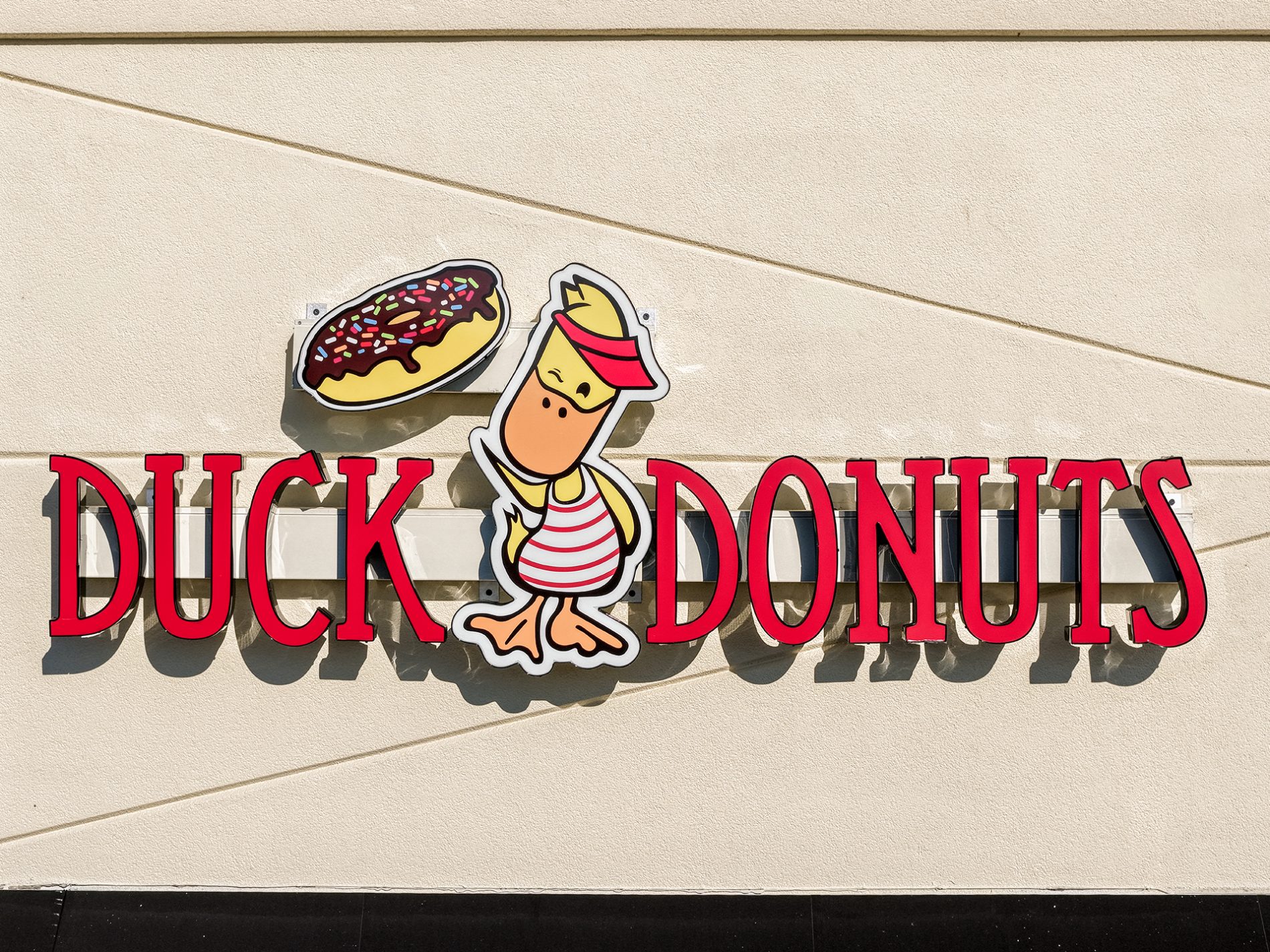
Distinct Sign Solutions recently installed a channel letter sign for Duck Donuts in Fredericksburg that turns the storefront into a beacon for made‑to‑order treats. The illuminated 3‑D letters—rendered in the brand’s warm orange and deep navy—capture Ollie’s playful spirit while improving day‑and‑night visibility for drive‑by and foot traffic. More than decoration, the robust channel letters reinforce Duck Donuts’ family‑rooted personality, support seasonal campaigns and promotions, and guide customers to the counter for customized donuts (and to “Join Our Flock”). It’s a high‑impact, cohesive application that elevates curb appeal and streamlines the guest experience.

Duck Donuts’s Building signs

In Fredericksburg, Duck Donuts' new building sign announces the shop with bold, friendly presence that matches the brand's warm orange and deep navy palette and playful Outer Banks storytelling. Placed prominently on the façade, the sign not only boosts curb appeal but serves as an unmistakable landmark that helps guests spot the made‑to‑order counter and seasonal promotions from the street. Paired with interior wayfinding and promotional graphics, this thoughtfully scaled building sign reinforces Duck Donuts’ family‑rooted personality, supports franchise consistency, and invites the community to join the flock for custom doughnuts, events, and the occasional Duck Truck visit.

Let’s build something distinct together.

Ready to bring your signage or surveying project to life? Our team is here to guide you from idea to install.

Request a quote

More channel letter signs

    Summa Locs

    Summa Locs

    Summa Locs in Stafford now greets clients with a striking channel letter sign that elevates Loc Oasis’s specialist loctician identity—illuminated three-dimensional letters ensure the studio is unmistakable by day and glowing at night. The bold, […]
    Dave’s Hot Chicken

    Dave’s Hot Chicken

    Recently installed in Fredericksburg, Dave’s Hot Chicken’s channel letter sign translates the brand’s high‑contrast, street‑food energy into striking, illuminated 3D letters that read as heat and urgency from blocks away. Crafted in the vivid red […]
    Domino’s Pizza

    Domino’s Pizza

    Distinct Sign Solutions recently installed a channel letter sign for Domino’s Pizza in Stafford, delivering bold, illuminated 3D lettering that makes the storefront unmistakable day or night. The high-impact, backlit letters reinforce Domino’s consistent visual […]
    Doctor Floss

    Doctor Floss

    Doctor Floss’s new channel letter sign in Spotsylvania elevates curb appeal with crisp, illuminated 3D letters that reflect the practice’s modern, patient-focused professionalism; the sign’s clean typography and night‑ready illumination make the full-service dental practice […]

More building signs

    Rappahannock Foot & Ankle

    Rappahannock Foot & Ankle

    Rappahannock Foot & Ankle’s new building sign in Spotsylvania announces their presence with professional clarity and the confidence patients expect from a regional leader in podiatric care. Featuring a durable, polished face and thoughtful illumination, the sign reinforces RFAS’s identity as a locally owned, multi‑provider practice staffed by board‑certified foot and ankle surgeons offering everything from bunion and hammertoe surgery to custom 3D orthotics, MyACT shockwave, Swift wart therapy, sports medicine, and same‑day urgent foot care. Prominent, easy to find and consistent with their patient‑education focus, the building sign strengthens wayfinding, trust, and the practice’s community‑focused brand.
    My Little Italy’s Pizza

    My Little Italy’s Pizza

    My Little Italy’s Pizza in Fredericksburg just unveiled a new building sign that anchors their storefront and instantly tells passersby where to find authentic, family-style pizza. Designed to withstand the elements and complement exterior finishes, […]
    Freedom Family Dentistry

    Freedom Family Dentistry

    Freedom Family Dentistry’s new building sign in Spotsylvania confidently anchors the practice’s move into an updated facility, offering unmistakable curb presence that reflects their modern, patient‑focused care. Designed to complement Dr. Neibauer’s decade of local […]
    Patriot Family Financial

    Patriot Family Financial

    Patriot Family Financial’s new building sign in Spotsylvania makes a confident, trustworthy first impression that mirrors the firm’s veteran‑owned identity and information‑first approach. Designed to echo the site’s flag imagery and clear typography, the sign […]

More signs in Fredericksburg, Virginia

    Edible Arrangements

    Edible Arrangements

    In Fredericksburg, Edible Arrangements now greets customers with a striking channel letter sign that echoes the brand’s bright, food‑forward personality and boosts visibility for same‑day gift deliveries. The illuminated 3D letters provide high-impact curb appeal […]
    Sunken Well Tavern

    Sunken Well Tavern

    Sunken Well Tavern’s new building sign in Fredericksburg blends historic charm with practical visibility: installed as a blade-style projection to catch foot and carriageway traffic just off Sunken Road, it helps define the tavern’s welcoming presence for neighbors and visitors alike. The perpendicular mounting makes the restaurant easy to spot from a distance, directing patrons to a neighborhood institution known for fresh, locally sourced fare. Even with the customer logo file needing a manual search, our team matched the tavern’s warm, approachable aesthetic so the sign supports their community-focused brand while enhancing curb appeal and nighttime legibility.
    Veera Aesthetics

    Veera Aesthetics

    Veera Aesthetics in Fredericksburg recently unveiled a new Blade sign—mounted perpendicular to the storefront and accented with refined vinyl graphics—that elevates the studio’s clinical-yet-inviting identity while improving visibility along busy downtown streets. The slim, illuminated […]
    Wilderness Community Church

    Wilderness Community Church

    Wilderness Community Church’s new Monument sign in Locust Grove gives the congregation a warm, steady presence at street level—an inviting, professional landmark that reflects its blend of in-person hospitality and robust online outreach. Positioned for clear visibility, the durable monument helps guide neighbors to weekly worship (with livestream on YouTube), volunteer opportunities through the Church Center app, and regular outreach like the monthly food pantry, wood-heating assistance, Rise Against Hunger events, and multilingual resources. Designed to welcome new guests and people seeking help, the sign reinforces the church’s commitment to service, connection, and long-term community care.