Signs & graphics review from
5 star rating
“I have been using DSS for over a decade and Patrick and the gang are phenomenal to work with!!!”
Our sign professionals handle every step so you can focus on running your business.

From permitting to installation, our clients count on us to deliver signs that are on‑brand, on time, and built to last. Here’s what local businesses had to say:
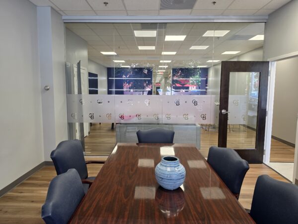
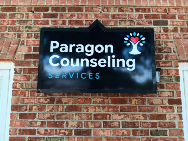
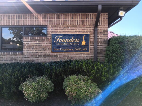
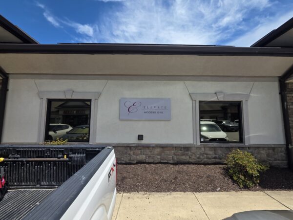
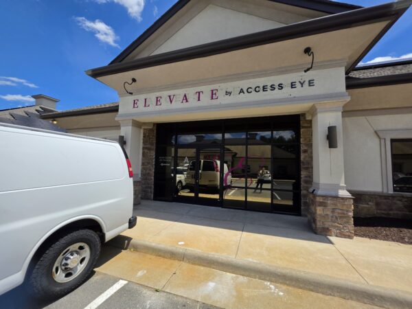
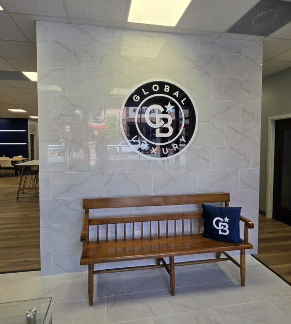
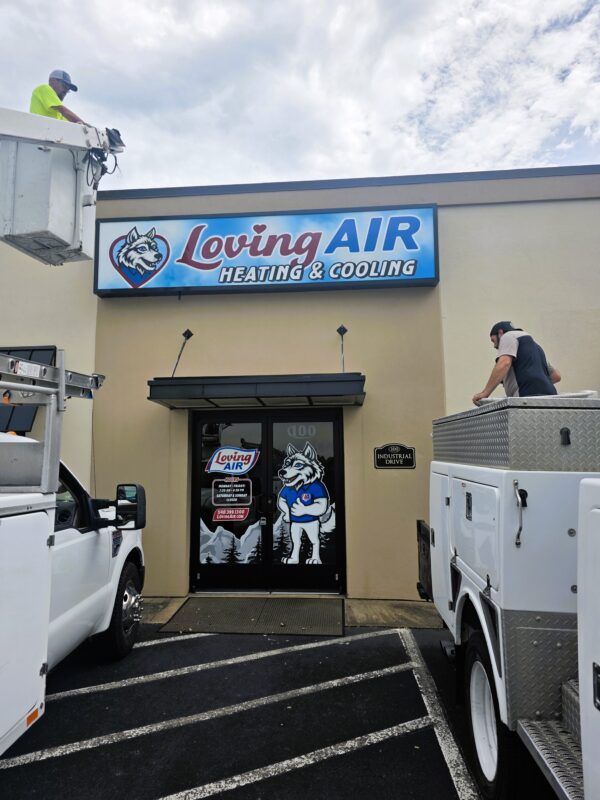
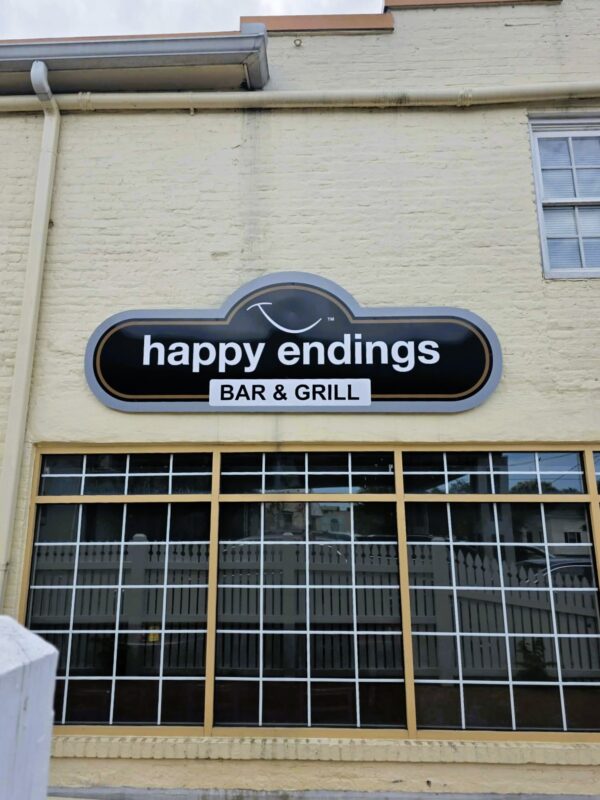
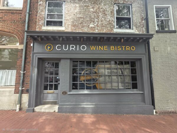
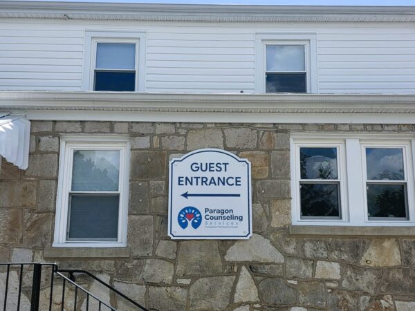
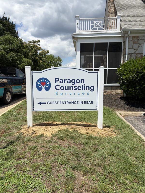
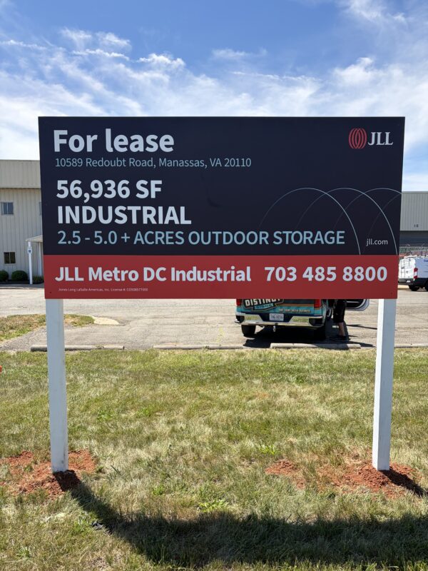
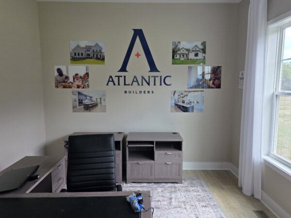
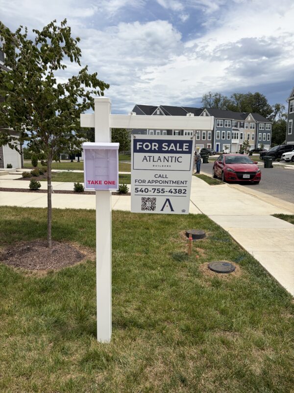
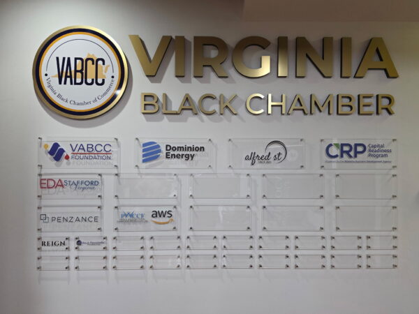
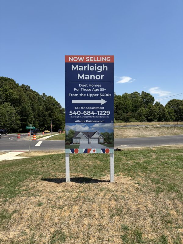
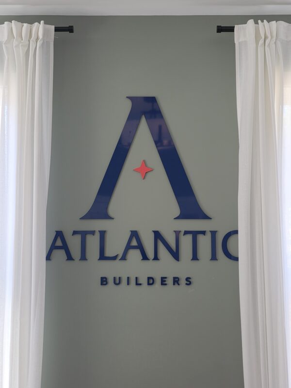
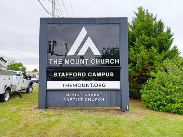
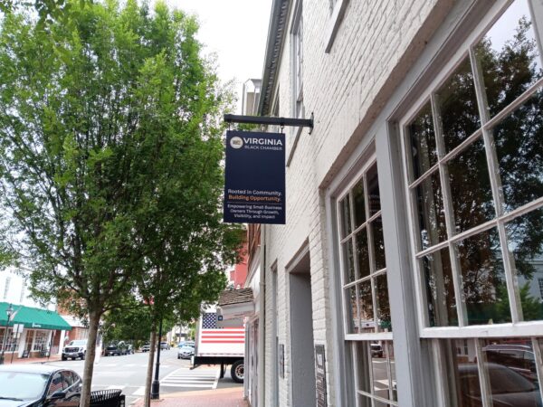
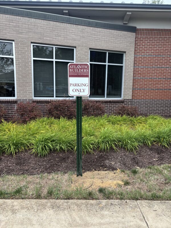
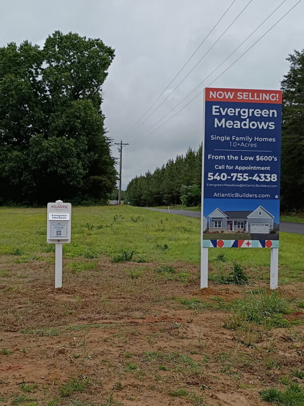
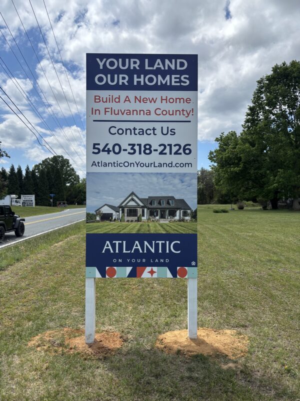
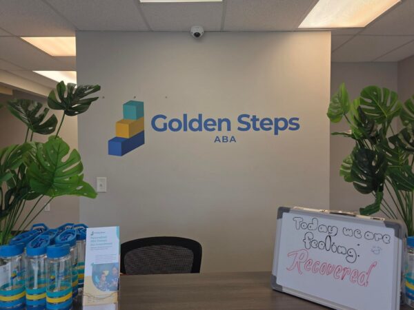
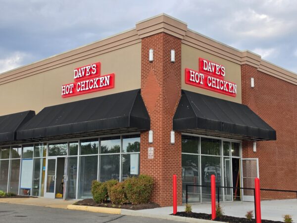
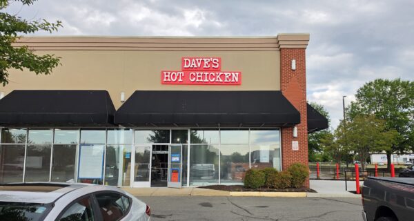
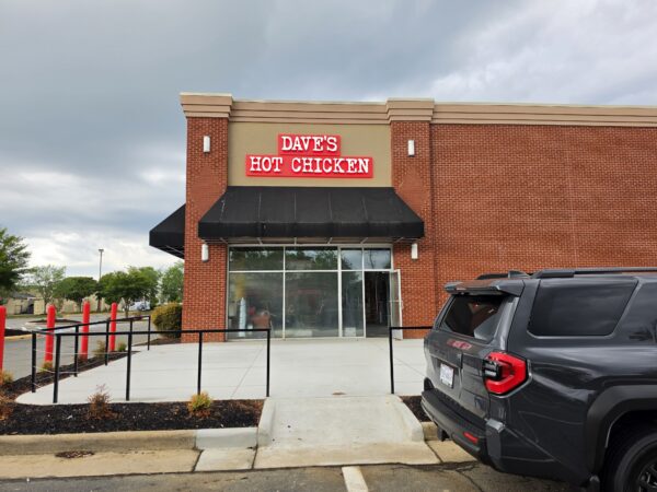
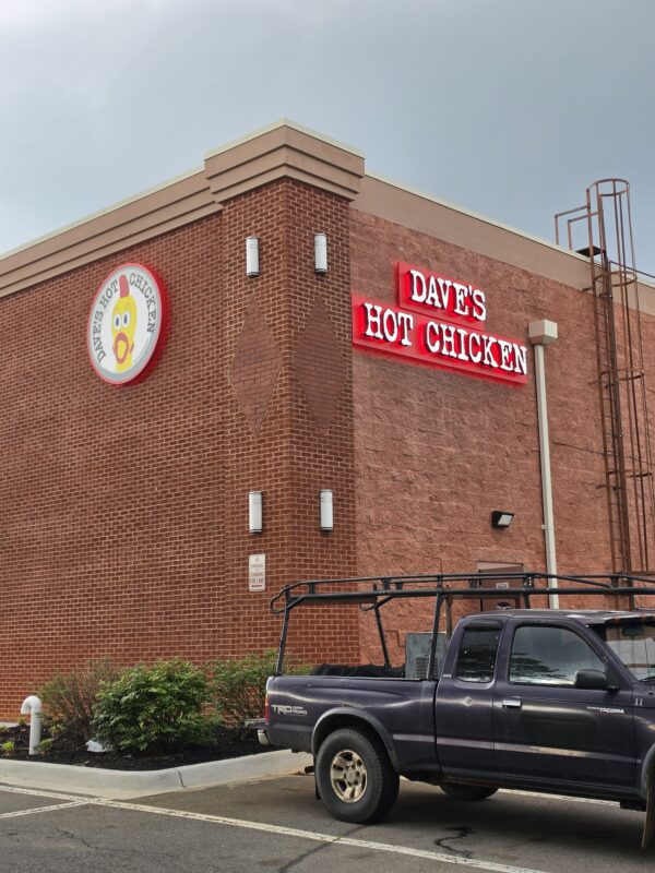
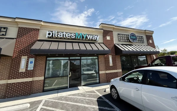
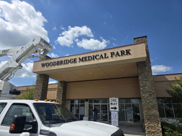
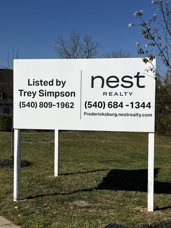
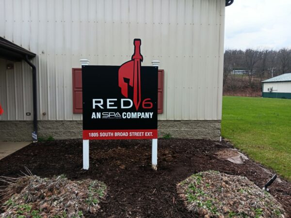
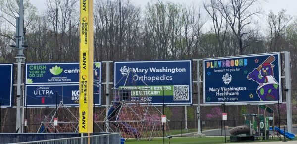
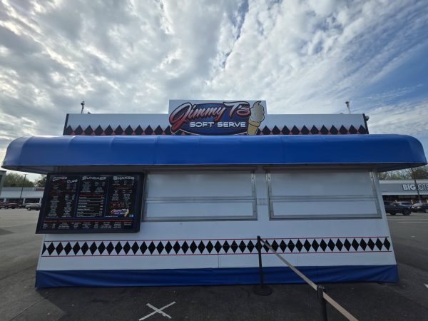
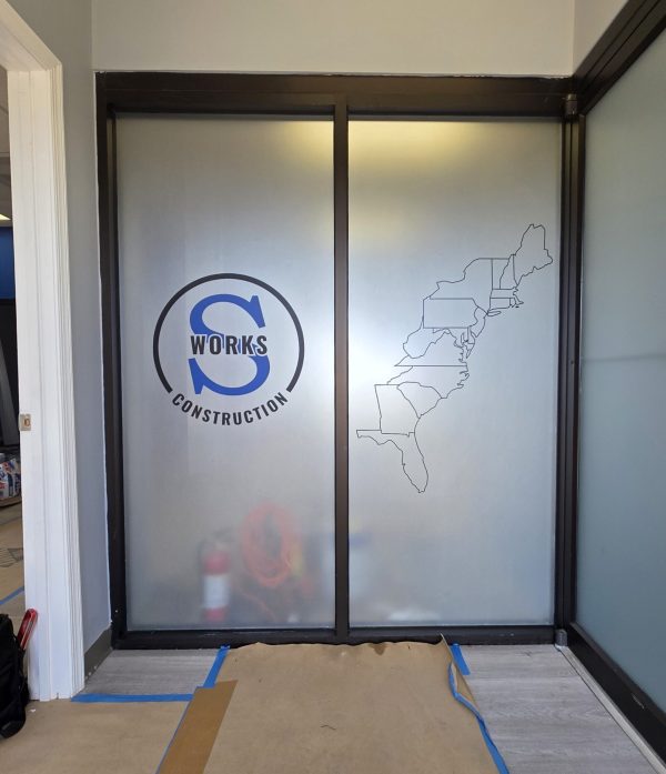
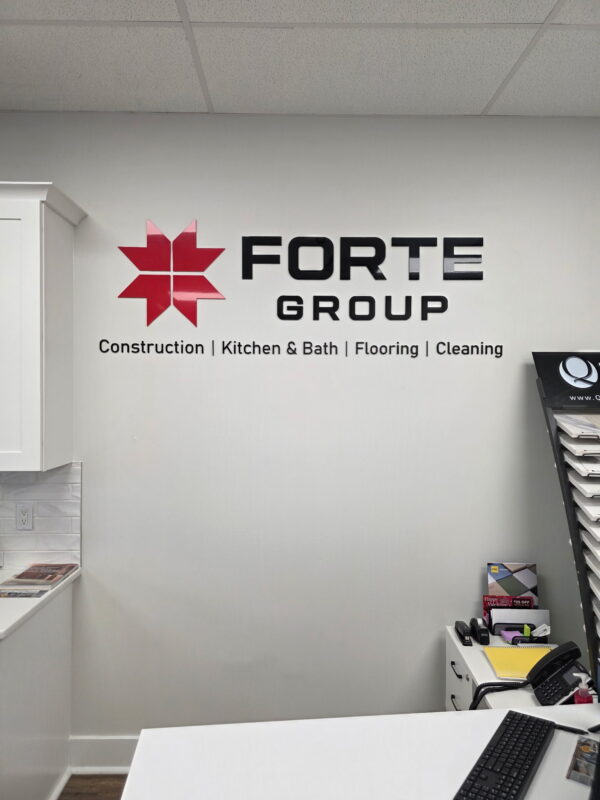
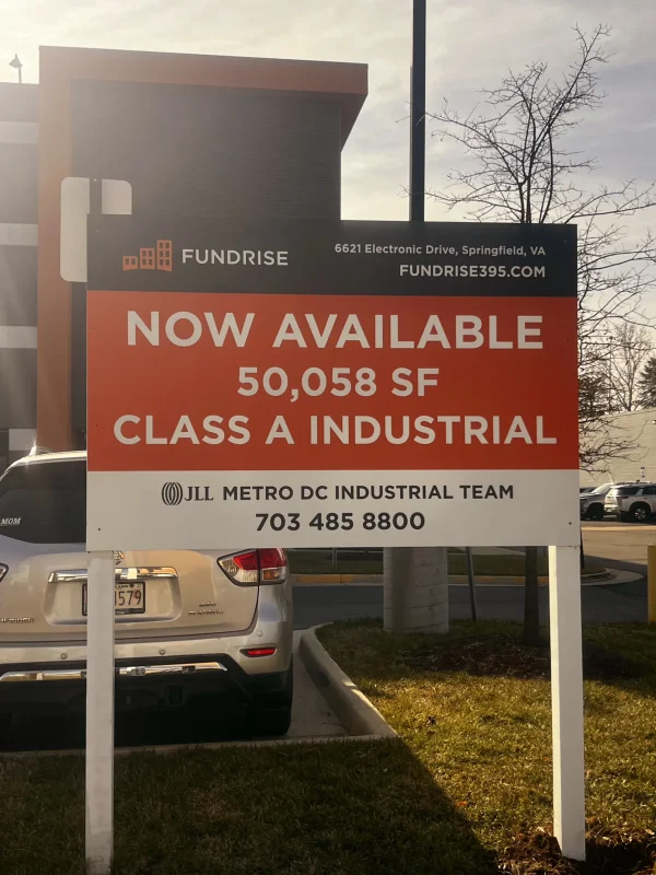
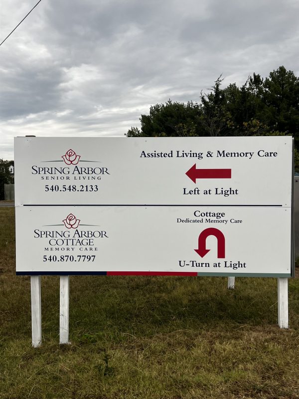
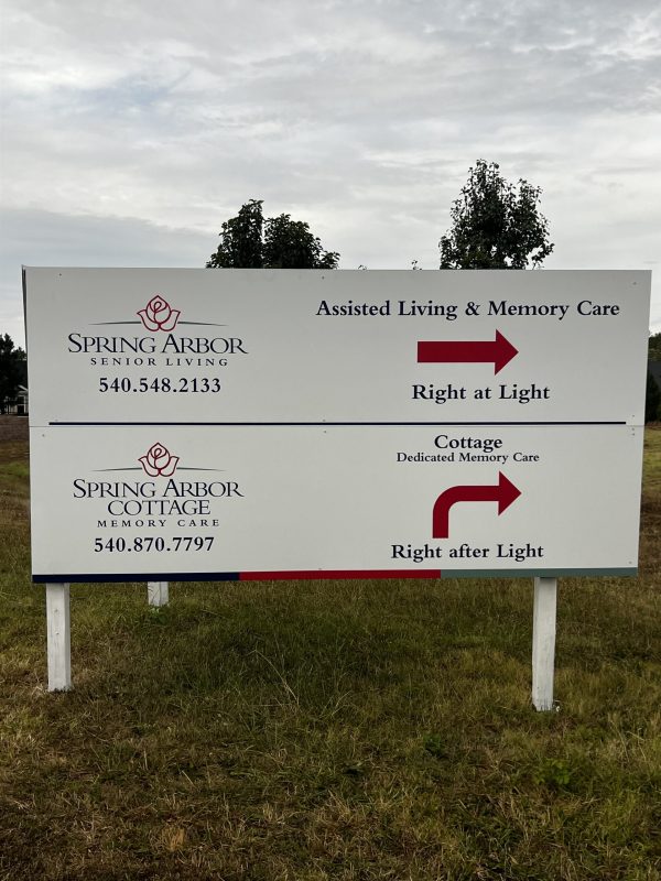
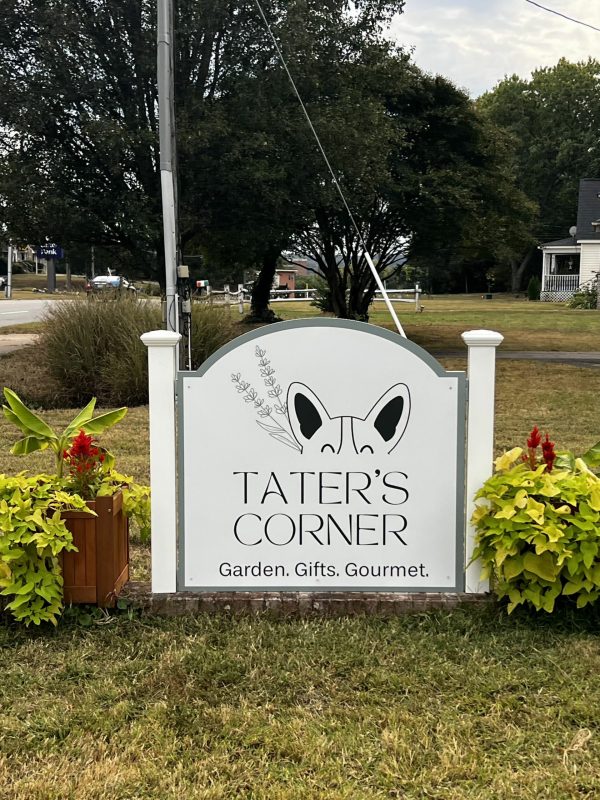
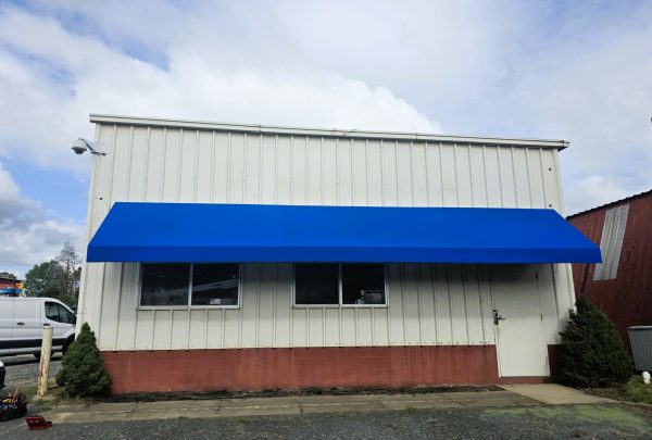
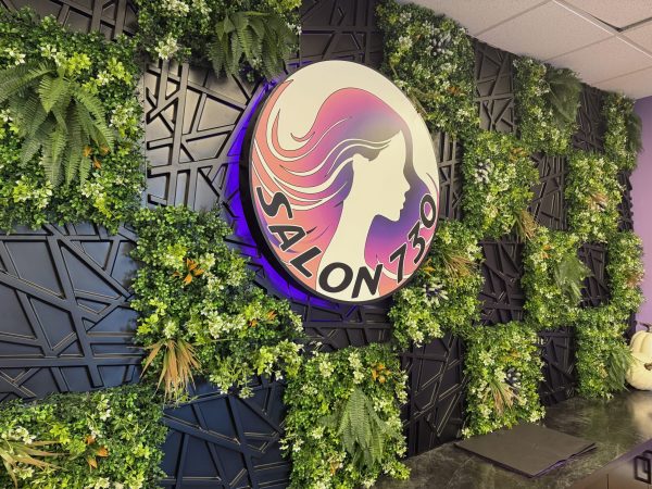
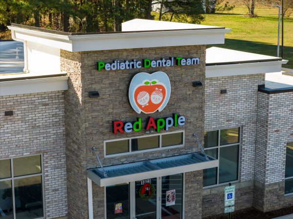
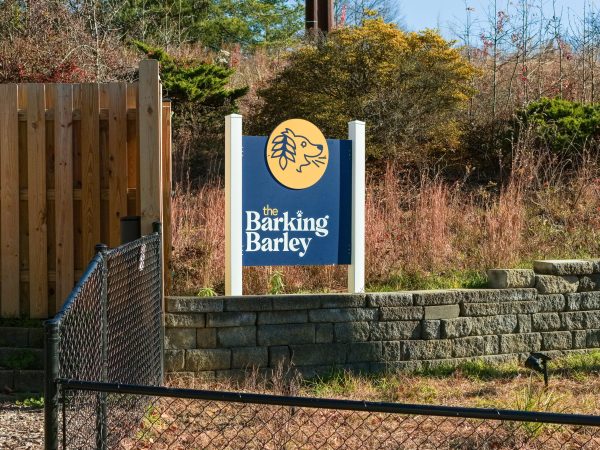
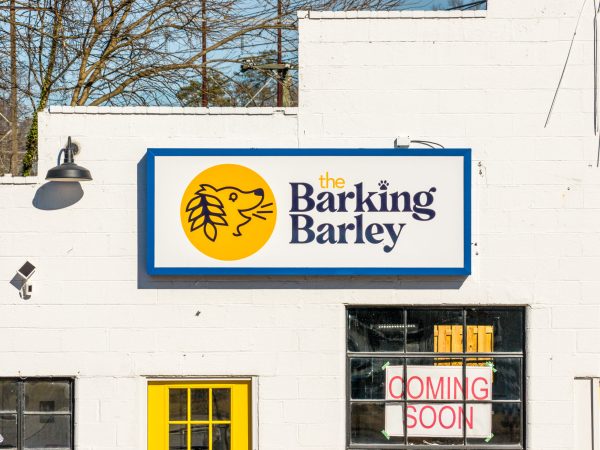
We’re proud to support local businesses, organizations, and franchises with signage that gets noticed. Here are just a few of the teams that trust Distinct Sign Solutions.


Create signage that brings clarity, credibility, and visibility to your business.


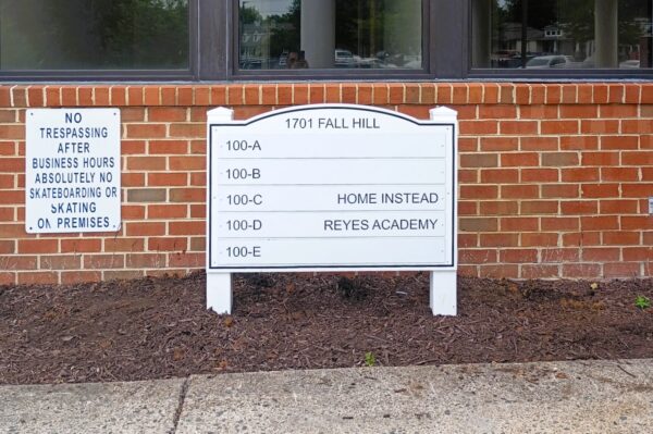
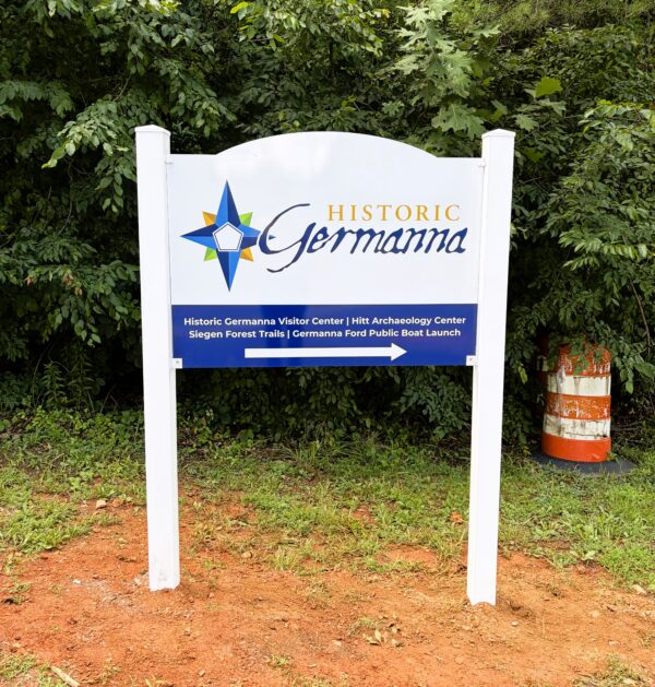
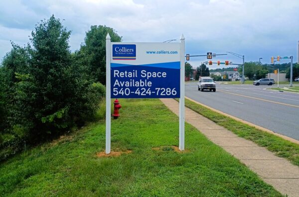
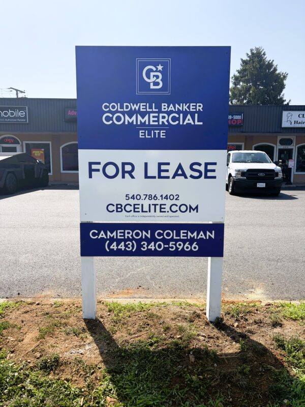
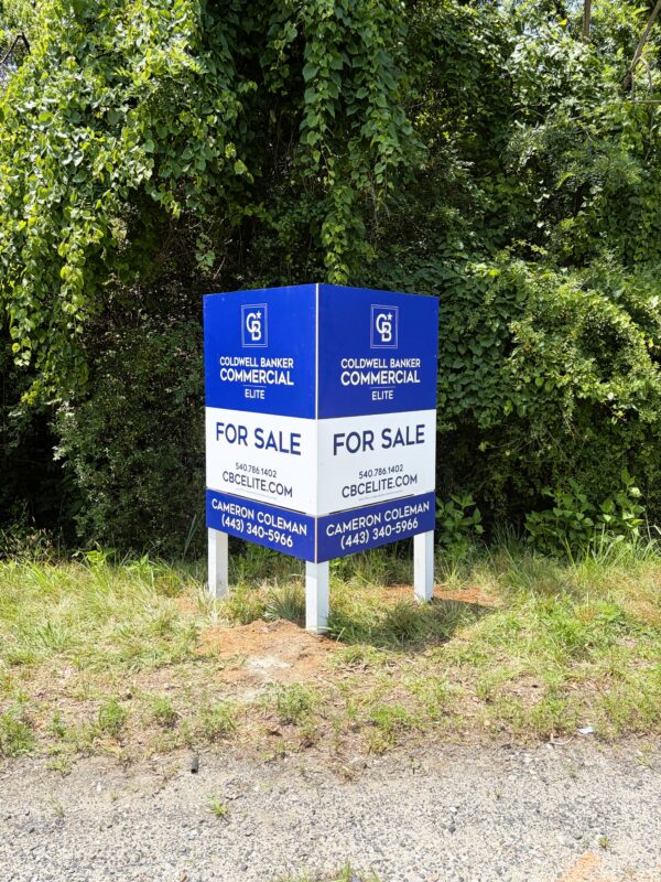
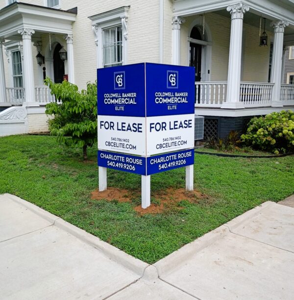
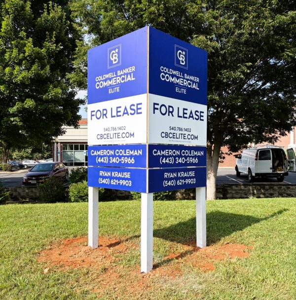
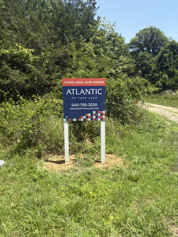
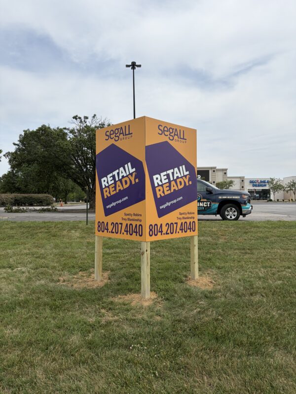
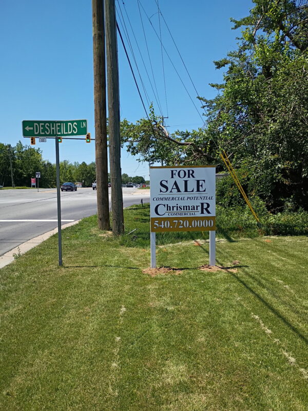
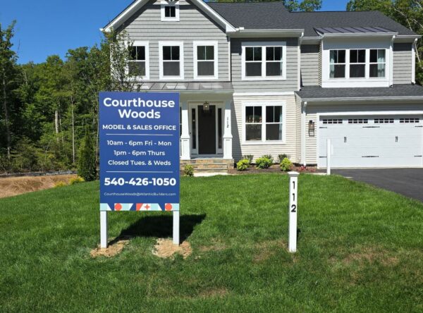
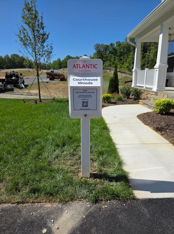
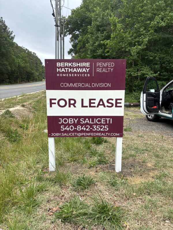
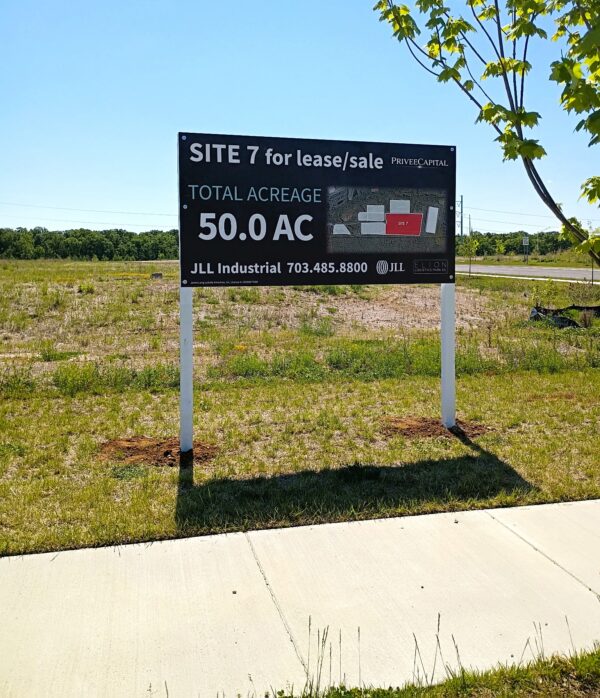
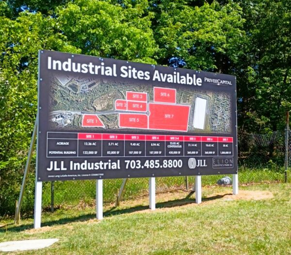
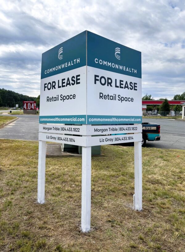
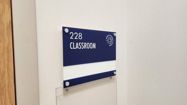
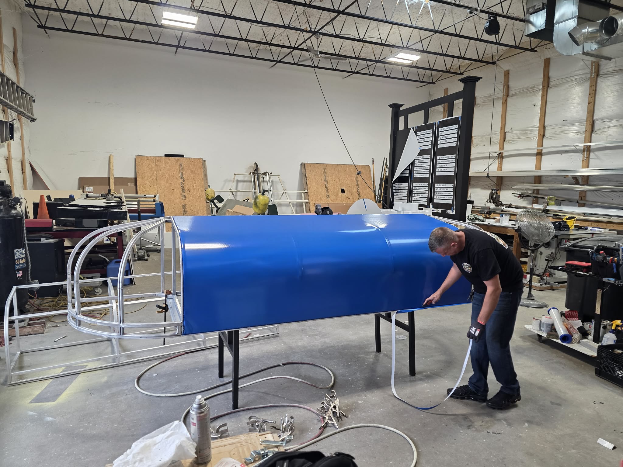
Loading signs

We’re here to solve problems, meet deadlines, and make your signage experience stress‑free from start to finish.
We’re UL Certified, which means your illuminated signage meets safety and quality standards—required for permitting in many areas.
Tight deadline? No problem. We’re known for getting signage designed, permitted, fabricated, and installed on time.
We know Fredericksburg, Stafford, Spotsylvania, and Richmond, and we’re built to serve them with efficient systems, real expertise, and honest communication.
Fill out the form below and our team will follow up with a quote or next steps, usually the same business day.

One of the first questions business owners ask when investing in signage is, "How much are signs for a business?" While it's a reasonable question, the answer isn't as straightforward…

When most people start researching signage types, they usually are not searching by technical sign names. They are searching for solutions to a business problem. Maybe you need customers to…
Investing in a new sign is a significant milestone for your business. The process should feel clear and organized from start to finish. If you’re planning your first sign or…