

Sunken Well Tavern’s Wayfinding signs
Sunken Well Tavern in Fredericksburg recently welcomed a new building sign in the form of purpose-driven wayfinding signage that gently guides guests from Sunken Road and the National Cemetery to its warm dining room and patio. Designed to reflect the tavern’s neighborhood hospitality and seasonal focus, the low-profile markers improve flow for locals and visitors alike while reinforcing the restaurant’s approachable brand. Our team handled a missing customer logo file by manually sourcing and matching existing brand elements to ensure visual consistency. The result is a durable, tasteful exterior solution that enhances curb appeal and makes every arrival effortless.

Sunken Well Tavern’s Blade signs
Sunken Well Tavern’s new building sign in Fredericksburg blends historic charm with practical visibility: installed as a blade-style projection to catch foot and carriageway traffic just off Sunken Road, it helps define the tavern’s welcoming presence for neighbors and visitors alike. The perpendicular mounting makes the restaurant easy to spot from a distance, directing patrons to a neighborhood institution known for fresh, locally sourced fare. Even with the customer logo file needing a manual search, our team matched the tavern’s warm, approachable aesthetic so the sign supports their community-focused brand while enhancing curb appeal and nighttime legibility.

Sunken Well Tavern’s Building signs
Sunken Well Tavern’s new building sign in Fredericksburg anchors the neighborhood restaurant with a polished, durable presence that honors its Sunken Road setting and invites both locals and visitors inside. Chosen to make a clear, unmistakable statement, the installation reinforces the tavern’s approachable, community-focused identity and guides guests to its welcoming dining room. Our team manually sourced and applied the client’s logo art to ensure the finished sign matched their established look and seasonal, locally rooted personality. A building sign like this provides long-lasting curb appeal and instant recognition—exactly the kind of steady, visible branding a longstanding neighborhood tavern needs.
Let’s build something distinct together.
Ready to bring your signage or surveying project to life? Our team is here to guide you from idea to install.
More blade signs

Hay Scale Alley
Distinct Sign Solutions outfitted Hay Scale Alley in Fredericksburg with a projecting blade sign that elegantly bridges the site’s modest architecture and rich storytelling, projecting from the storefront so pedestrians and tour groups along Caroline Street can spot it from afar. The compact yet eye-catching design complements the alley’s retail heritage and interpretive programming—guiding visitors to curated tours, the nearby tunnel access, and keepsake offerings—while durable materials and a polished finish respect the historic fabric. As a visible wayfinding anchor, the blade sign reinforces Hay Scale Alley’s identity as a small but vital hub of community memory and engagement.

Fredericksburg Area Museum (FAM)
The Fredericksburg Area Museum (FAM) recently installed a striking blade sign in downtown Fredericksburg, mounted perpendicular to the storefront so visitors can spot the museum from blocks away. This eye-catching, street-facing solution complements FAM’s community-centered mission—inviting families, school groups, and passersby to discover rotating exhibitions, Escape the Museum programs, and focused local-history initiatives, including African American programming and outreach. A blade sign enhances wayfinding and curb appeal without overwhelming the historic streetscape, helping FAM connect residents and visitors with archives and events while reinforcing accessibility and a warm, approachable brand presence at the heart of Fredericksburg.

Pooch Purrfect
In Dumfries, Pooch Purrfect’s new blade sign brings the brand’s “eat. play. love.” philosophy out onto the street—mounted perpendicular to the storefront it’s instantly visible to pedestrians and passing drivers, guiding neighbors to the boutique, […]

The Port Oysteria and Brewery
The Port Oysteria and Brewery’s new blade sign in Fredericksburg is a smart, street-facing way to catch the eye of passersby and guide diners toward its riverfront raw bar and beer garden; mounted perpendicular to […]
More wayfinding signs

Morningside House
At Morningside House in Spotsylvania, we installed a polished acrylic sign serving as essential wayfinding that reflects the community’s “aging with care” mission; the durable, low‑gloss acrylic provides a professional, tactile finish that complements the […]
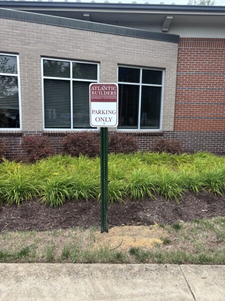
Atlantic Builders
Atlantic Builders recently installed Wayfinding signs in Fredericksburg, Virginia to guide visitors through its community model centers and neighborhoods with clarity and care. Thoughtfully designed for indoor and outdoor use, these directional signs reflect Atlantic’s […]
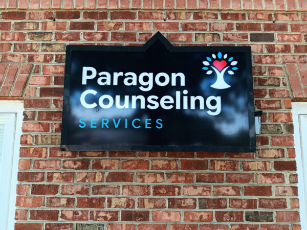
Paragon Counseling
Paragon Counseling’s newly installed wayfinding signs in Fairfax, Virginia provide clear, compassionate guidance that reflects the clinic’s family-centered, inclusive approach. Placed throughout the building and grounds, these durable, professionally finished directional markers help families, caregivers, […]

O’Reilly Auto Parts Distribution Center
The new wayfinding signage at O'Reilly Auto Parts Distribution Center in Stafford brings clarity and safety to a fast-paced inbound operation, guiding team members from dock doors through staging areas to RF-directed racking with unambiguous, durable markers and zone labels. Designed to support high-volume unloading, count verification, discrepancy research, and on-the-job training, the system reduces errors and speeds workflow while reinforcing O’Reilly’s promote‑from‑within culture by helping new hires and trainers navigate the facility confidently. By aligning clear directional cues with operational priorities, the signage enhances inventory accuracy, team communication, and overall efficiency across the distribution center.
More building signs

Rey Azteca Mexican Restaurant
Rey Azteca Mexican Restaurant in Fredericksburg now greets guests with a striking building sign that translates the restaurant’s warm, vibrant identity into an unmistakable storefront presence. Working with Distinct Sign Solutions, the custom-built sign mirrors […]

Selfie Social
Selfie Social’s new building sign in Fredericksburg makes a bold, on-brand statement that defines the studio’s location and invites passersby into its immersive photography world; designed to be a high-impact visual anchor, the exterior sign […]

Bumrush Vinyl Shop
Bumrush Vinyl Shop’s recently installed building sign in Fredericksburg boldly announces their physical presence and mirrors the store’s visually driven, crate-digging personality — a perfect complement to their Shopify storefront and curated selection of 7″ […]

Sika
Sika’s new Building sign in Stafford, Virginia announces the company’s expanded presence with clarity and confidence, marking the site of its major concrete admixtures plant that strengthens service to the Northeast and Mid‑Atlantic. The durable, […]
More signs in Fredericksburg, Virginia

Orofino Wellness
Orofino Wellness in Fredericksburg recently unveiled a custom illuminated halo acrylic sign that blends polished modern styling with warm, approachable visibility. The acrylic face delivers a clean, durable canvas for the studio’s refined logo while the halo illumination creates a soft backlit glow that reads equally well day or night—perfect for a boutique Pilates studio offering Reformer classes, nutrition coaching and immersive retreats. This combination enhances curb appeal, helps guide new and returning clients to the welcoming, intimate space, and reflects the studio’s focus on long-term, compassionate wellness through a professional, understated presence that supports brand recognition and community connection.

Atlantic Builders
Atlantic Builders recently installed wayfinding signage in Fredericksburg to streamline visitors’ journeys through their community and model home centers. As a long-established, award-winning homebuilder with more than 35 years serving Virginia, Atlantic prioritizes clear communication […]

Metro Nova Creative
Metro Nova Creative’s new custom office signage in Fredericksburg gives the studio’s brand a tangible, professionally polished presence that aligns perfectly with its strategic design work. Founded by Dan Craddock in 2014, the team translated […]